Matplotlib. It’s a cornerstone of Python plotting. But, as is often the case, what if you want your audience (or yourself) to interact with your plots – zoom in on details, hover over points to see values, or toggle datasets on and off?
For that, the Plotly charting library offers a compelling, modern alternative. It often requires only minimal changes to your existing codebase to significantly improve the user experience.
In this article, I’ll provide several examples of using Plotly and Matplotlib on the same datasets to illustrate their key differences.
By the end, you should have enough knowledge to decide exactly why you might want to start using one over the other.
I have no affiliation or commercial association with the Plotly or Matplotlib libraries or the people or companies who created them.
What is Matplotlib?
If you’ve done any graphing with Python in the past, you likely already know Matplotlib. It’s the veteran plotting library for Python, providing tremendous flexibility and control for creating static, publication-quality charts and graphs. Developed by John D. Hunter, an American neurobiologist, it was initially designed to mimic MATLAB’s plotting capabilities. Its strength lies in its ubiquity, extensive documentation, and fine-grained control over almost every plot element.
Another popular library, Seaborn, is built on Matplotlib and provides higher-level interfaces for drawing attractive statistical graphics. The primary output is typically static images, such as PNG, JPG, and PDF.
What is Plotly, and why do you need it?
Plotly is a modern, open-source graphing library that creates ** interactive** visualisations. Developed by Plotly Technologies, it allows you to build beautiful charts that users can interact with directly in a web browser or a Jupyter notebook. These interactions include zooming, panning, hovering to see data point values, selecting regions, and more. Plotly charts are described as JSON objects and rendered using the Plotly.js JavaScript library. The Python library (plotly.py) provides an easy interface for creating these JSON structures.
Why do you need it? Mainly because its interactivity transforms data visualisation from a passive viewing experience into an active exploration tool. It allows users to:
- Explore Details.Zoom into dense areas of a plot.
- Identify Specific Points.Hover over elements to see exact values without cluttering the plot with labels.
- Compare Subsets.Toggle traces (lines, bars, etc.) on and off via the legend.
- Share Richer Insights.Embed fully interactive plots in websites, dashboards (like Plotly Dash), or share them as standalone HTML files.
Generally, interactive plots are often far more insightful than static images for exploratory data analysis, presentations, and web applications.
Ok, with that being said, let’s get into our examples.
Prerequisites
You’ll need Python and pip (or Conda) installed. We’ll use Pandas for basic data handling, Matplotlib and Seaborn for the baseline comparison, and Plotly for the interactive alternative.
Before that, let’s set up our development environment. I use Conda for this, but you can use whatever tool or method suits you.
```
create our test environment
(base) $ conda create -n python_plots python=3.13 -y
```
Now, activate the environment and install the required libraries.
(base) $ conda activate python_plots
(python_plots) $ pip install matplotlib seaborn pandas plotly jupyter numpy
Now type in jupyter notebook into your command line prompt. You should see a Jupyter Notebook open in your browser. If that doesn’t happen automatically, you’ll likely see a screenful of information after the jupyter notebook command. Near the bottom, you will find a URL to copy and paste into your browser to launch the Jupyter Notebook.
Your URL will be different to mine, but it should look something like this:-
http://127.0.0.1:8888/tree?token=3b9f7bd07b6966b41b68e2350721b2d0b6f388d248cc69da## Example 1: A Simple Scatter Plot
Let’s start with a basic scatter plot comparing two variables. First, we’ll generate some sample data using NumPy and Pandas.
```
import numpy as np
import pandas as pd
import matplotlib.pyplot as plt
import seaborn as sns
import plotly.express as px
from timeit import default_timer as timer
Generate some sample data
np.random.seed(42)
n_points = 100
data = pd.DataFrame({
'x_values': np.random.rand(n_points) * 10,
'y_values': 2.5 * np.random.rand(n_points) * 10 + np.random.randn(n_points) * 5,
'category': np.random.choice(['A', 'B', 'C'], n_points)
})
print(data.head())
Output
x_values y_values category
0 3.745401 11.156643 C
1 9.507143 18.211831 B
2 7.319939 18.198903 A
3 5.986585 12.181994 C
4 1.560186 4.961931 C
```
Now, we can plot this using Matplotlib (via Seaborn for slightly nicer defaults and easy colouring by category).
```
--- Matplotlib/Seaborn ---
start = timer()
plt.figure(figsize=(8, 5))
sns.scatterplot(data=data, x='x_values', y='y_values', hue='category')
plt.title('Matplotlib Scatter Plot')
plt.xlabel('X Values')
plt.ylabel('Y Values')
plt.grid(True)
plt.show()
print(f"Matplotlib time: {timer()-start:.4f} seconds")
```
This generates a familiar static scatter plot.
Now, let’s create the same plot using Plotly Express, which provides a high-level interface similar to Seaborn.
Unfortunately, I can only post an image of the chart that’s produced. To experience the full range of interactivity that Plotly provides, please run the code in your own environment
```
import plotly.express as px
--- Plotly Express ---
start = timer()
fig = px.scatter(data, x='x_values', y='y_values', color='category',
title='Plotly Interactive Scatter Plot',
labels={'x_values': 'X Values', 'y_values': 'Y Values'})
fig.show()
print(f"Plotly time: {timer()-start:.4f} seconds")
```
The two code sets are quite similar, but the output appears slightly different. The Plotly graph looks better and has a more modern aesthetic in my opinion. Also, using Plotly, you instantly get:-
- Hover Text.You can move your mouse over points to see their exact coordinates and category.
- Zoom and Pan.You can click and drag to zoom into regions, and double-click to reset.
- Interactive Legend.You can click on legend items (‘A’, ‘B’, ‘C’) to hide or show specific categories.
The actual rendering happens in your browser via JavaScript. Although the code complexity is comparable, the user experience when using Plotly is greatly enhanced.
Notice also the line of icons associated with the Plotly output, located near the top-right corner of the screen. These allow quick access to various functionalities, for example,
- Zoom in/out
- Graph reset
- Downloading the graph as a PNG
- Panning
- Selection
Example 2: Line Plot Over Time
We’ll simulate some time-series data and plot it.
```
Generate sample time-series data
date_rng = pd.date_range(start='2023-01-01', end='2023-12-31', freq='D')
ts_data = pd.DataFrame(date_rng, columns=['date'])
ts_data['Sensor A'] = np.random.randn(len(ts_data)).cumsum() + 50
ts_data['Sensor B'] = np.random.randn(len(ts_data)).cumsum() + 70
Reshape for plotting
ts_data = ts_data.melt(id_vars='date', var_name='Sensor', value_name='Reading')
print(ts_data.head())
Output
date Sensor Reading
0 2023-01-01 Sensor A 50.496714
1 2023-01-02 Sensor A 49.861736
2 2023-01-03 Sensor A 50.647689
3 2023-01-04 Sensor A 52.827631
4 2023-01-05 Sensor A 53.003948
```
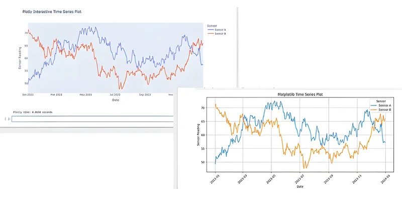
Again, using Matplotlib or Seaborn creates a standard static line chart.
import matplotlib.pyplot as plt
fig, ax = plt.subplots(figsize=(12, 6))
for sensor, group in ts_data.groupby("Sensor"):
    ax.plot(
        group["date"],
        group["Reading"],
        label=sensor,
        linewidth=1.5
    )
ax.set_title("Daily Sensor Readings – 2023")
ax.set_xlabel("Date")
ax.set_ylabel("Reading")
ax.legend(title="Sensor")
ax.grid(True, alpha=0.3)
fig.autofmt_xdate()
plt.tight_layout()
plt.show()
Now with Plotly Express.
With Plotly, you can easily zoom in on specific weeks or months, hover over a particular day to see the exact reading for either sensor, and toggle the lines on and off using the legend. This is invaluable for exploring trends and anomalies in time-series data.
Example 3: Saving and Sharing
How you save and share plots using the two tools differs significantly in one key aspect.
With Matplotlib, you typically save to static image formats using code similar to this.
```
Assuming 'plt' holds the figure from Example 2
plt.savefig('matplotlib_timeseries.png', dpi=300)
plt.savefig('matplotlib_timeseries.pdf')
```
You can share these image files freely (PNG, PDF, etc.).
With Plotly, you can also save as static images, but the real power is in saving as an interactive HTML file.
```
Assuming 'fig' holds the Plotly figure from Example 2
fig.write_html("plotly_timeseries.html")
Requires kaleido package: pip install -U kaleido
fig.write_image("plotly_timeseries.png")
```
The plotly_timeseries.html file is self-contained. You can open it in any web browser, and all the interactivity (zoom, hover, pan) works without needing Python or any libraries installed. This is fantastic for sharing results with colleagues or embedding in web reports.
When to Choose Which?
Choose Matplotlib when:
- You only need static, publication-quality images (e.g., for academic papers, reports where interactivity isn’t possible).
- You need extremely fine-grained control over every plot element (though Plotly’s lower-level graph_objects API also offers this).
- You are working in an environment where rendering JavaScript and HTML isn’t feasible.
- You prefer its specific API or are working with legacy code.
Choose Plotly when:
- Interactivity is desired for data exploration or presentation.
- You’re building web applications or dashboards, especially with Plotly Dash.
- You want to share interactive plots as standalone HTML files easily.
- You prefer the often more concise syntax of plotly.express for common plot types.
Performance Considerations
While Plotly’s Python execution is usually fast enough, rendering complex, interactive plots with ** massive** datasets (tens or even hundreds of thousands of data points) directly in the browser can be slow. For such cases, Plotly offers solutions such as WebGL-based plots (Scattergl, Linegl) and integration with tools like Datashader for server-side rendering inside Dash applications.
Matplotlib generally performs well for static visualisations because charts are rendered once, either on screen or to an image file. However, as with Plotly, charting thousands of individual points can still be slow and memory-intensive.
In practice, Matplotlib is the better choice for large static charts, while Plotly is preferable when interactivity is important, and the dataset is small enough to be handled efficiently in the browser. What does small enough mean? There’s no definitive answer. That’s just something you’ll have to trial and error in your own workflow.
Summary
Matplotlib remains the foundational plotting library in Python, essential for static visualisations. However, for many modern use cases involving data exploration, presentations, and web-based reporting, Plotly offers a significant upgrade by making plots interactive. With the high-level plotly.express module, creating these interactive plots often requires minimal code changes compared to Matplotlib/Seaborn, while providing a much richer user experience.
If you haven’t tried Plotly yet, especially for exploratory analysis or sharing results, give it a go. You might find that the ability to zoom, pan, and hover transforms how you and others engage with your data visualisations.