A few days ago, I came across a close-up of Elizabeth Taylor in Ivanhoe (1952) on social media. Like the features of the actress in her role as the medieval heroine Rebecca of York, the footage was vivid. The lips were of an almost unreal crimson and the lapis lazuli eyes with their violet sparkles acquired an authority of their own and dominated the frame with a liveliness that is difficult to find today. So the question was: how long had it been since I had gotten such a chromatic thrill in a movie theater?
The summer releases of Christopher Nolan’s The Odyssey and Michael Sarnoski’s The Death of Robin Hood illustrate how high-budget cinema that aims for an aura of prestige has embraced a very recognizable aesthetic of washed-out colors. To a viewer from the middle of the last century, what would surprise them most about The Odyssey, beyond its special effects and thunderous soundtrack, is that a blockbuster that has cost $250 million looks veiled in a blizzard of sand. Today, the footage is digitally manipulated to result in an ochre or grayish sheen that, compared to classic Hollywood films, is rather bland. Some may even think it ugly.
This change becomes glaring if we contrast these two epic movies with the last Robin Hood film starring Errol Flynn in 1938 or the 1955 version of Homer’s classic directed by Mario Camerini on which Silvana Mangano’s sorcerer Circe appears bathed in an emerald, green light.
But these are not isolated cases: recently, the same technique has been used in other movies with historical backdrops such as Macbeth (Justin Kurzel, 2015), Lady Macbeth (William Oldroyd, 2016), The King (David Michôd, 2019), The Wonder (Sebastián Lelio, 2022), The Northman (Robert Eggers, 2022), Firebrand (Karim Aïnouz, 2023) and Wuthering Heights (Emerald Fennel, 2026). And last year Chloé Zhao’s Hamnet entered the Oscars race with that same visual register used also in French blockbusters such as The Count of Monte Cristo and The Three Musketeers: D’Artagnan, and Spanish movies from Alatriste to El Cautivo.
In all these cases, the absence of color tells us we are watching an important film, suitable both for an award and box office success, as discussed by the artist and scholar David Batchelor in his book Chromophobia (Ed. Síntesis), originally published in 2000. According to Batchelor, this expulsion of color usually takes place in one of two ways. In the first, the color is attributed to some “foreign” body: the oriental, the feminine, the infantile, the vulgar, or the pathological — or by relegating it to the realm of the superficial, the supplementary, the inessential, or the cosmetic. In the first case, the color is considered something strange and, therefore, dangerous; in the second, it is perceived simply as a secondary quality of experience and, therefore, unworthy of serious consideration.
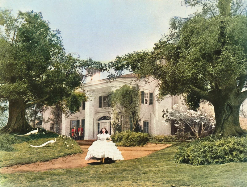
This is quite the opposite of what was considered to be the case when color cinema was first introduced. Films such as Becky Sharp (1935), The Wizard of Oz (1939) and Gone with the Wind (1939) afforded great splashes of technicolor to adapt renowned novels with aspirations to the same goals as the aforementioned ones. The new color technology provided a palette of excessive exuberance but, when it was toned down, the chromaticism was not lost. The tradition would continue with older filmmakers from Michael Powell and Emeric Pressburger to Vincente Minnelli, from John Ford to Alfred Hitchcock and David Lean — the Bolshevik revolution in Doctor Zhivago in full color would be unthinkable today.
Even during the last decades of the 20th century, the winners of the Academy Awards would continue along this path: Amadeus, Out of Africa, The Color Purple, The Last Emperor (here the reds and golds of Vittorio Storaro’s photography simulate fire), Dances with Wolves, Braveheart and L.A. Confidential are just a few examples. Perhaps Shakespeare in Love was the swan song: in 1999 it won the battle of the Oscars, but in the aesthetic war the winner was Steven Spielberg’s Saving Private Ryan, whose faded visual hues would prevail from then on.
Roman Polanski’s The Pianist (2002) was already playing with a more muted palette, not to mention Peter Jackson’s The Lord of the Rings: The Return of the King (2003). But the trend has accelerated in the last decade; take filmmaker Ridley Scott, once characterized by a rich color scheme but now a loyal fan of the greige filter in his period films. Gone are the days when the protagonists of Titanic (James Cameron, 1997) challenged the norms of nature by being bathed in the light of a hyperpigmented sunset.
“Are you the bard of a civilization at dusk?” Chinese researcher Zhong Shu asked director Christopher Nolan. If so, we are facing the most colorless sunset in history. The example of The Odyssey is especially graphic because it flags up the misunderstanding that has existed for centuries over the art of ancient Greece. Early 19th-century scholars who insinuated that the marbles were originally painted in bright colors were met with skepticism or derision. But they were right: they were so vivid that today they would seem openly kitsch, whatever the neoclassical historian Johan Joachim Winckelmann with his theories of a supposed Greek whiteness, maintained. Odysseus’ adventures take place in the Bronze Age, centuries before classical Greece, but by then the material culture of the Aegean world was already multicolored. In Contempt (1962), Jean-Luc Godard’s film about the filming of a version of The Odyssey directed by Fritz Lang, the scenes from The Odyssey do illustrate this saturated visual color scheme.
And it was not only Godard’s thing. When it came to recreating past eras, many directors of twentieth-century international cinema resorted to an abundance of color as another expressive tool, used sensitively and meticulously: Visconti (The Leopard, The Innocent), Fellini (Satyricon), Kurosawa (Kagemusha, Ran), Parajanov (The Color of the Pomegranate), Kubrick (Spartacus, Barry Lyndon), Zhang Yimou (Red Sorghum, Raise the Red Lantern), Manoel de Oliveira (Francisca, The Satin Slipper) and Eric Rohmer, who in Perceval le Gallois imagined a Middle Ages in brilliant shades.
Ingmar Bergman made the crimson walls of the set of Cries and Whispers an aesthetic manifesto. And Peter Greenaway upped the ante in The Draughtman’s Contract and The Baby of Mâcon. So this premise of certain colors being associated with the frivolous, the queer, the feminine or the exotic was not always adhered to. From a patriarchal viewpoint, recall the recent duel at the box office between Greta Gerwig’s ultra-pink Barbie and Oppenheimer, also directed by Nolan with a predominance of somber tones. Today, Pedro Almodóvar, Todd Haynes and Luca Guadagnino are determined to stick to color (perhaps they are spoiled because they are openly homosexual directors and therefore converge with expectations in this regard). Meanwhile, Wes Anderson’s aesthetics are often vilified by critics who consider his cinema fake or superficial: “A colorful collection of cute vignettes,” was how his Asteroid City (2023) was summed up in a recent review in Espinof.
It can be understood from all this that historically themed cinema does not try so much to represent the past as to make it compatible with contemporary concerns and visual sensitivities, something that in reality has always happened. Films set in the Middle Ages or the 19th century reproduce the disenchantment of the 21st century, and their ashen tones seem to reflect an overwhelmingly pessimistic mood. It may also be the case that, in the face of the excess of vulgar and indiscriminate color on social media, cinema has sought an alternative. This has become the norm to such an extent that if a director were to photograph ancient Greece with the green of the olive trees, the blue of the Mediterranean and the reds and yellows of the original pigments, his film would be compared to a perfume commercial, if not something even lower in the cultural hierarchy.
It is also worth asking when all this began. One possibility is the film Queen Margot (1994), by Patrice Chéreau that was considered innovative for portraying a Renaissance court using dim lighting, closer to horror than historical cinema. The effect was to throw up echoes of the massacres in the former Yugoslavia. A decade earlier, Chéreau had been one of the actors in Danton (1983), by Andrej Wajda, which depicted the French Revolution by changing the cheerful pastel tones of Rococo and Neoclassical art for dirtier ones in order to bring a note of realism to its retelling.
Soon that search for an anti-academic way of approaching period films would end up leading to a new academicism, in which the aesthetics of war photojournalism and digital cameras are used to represent eras that were much more colorful.
The trend is far from exhausted. This can be deduced from the trailers of upcoming releases such as Sense and Sensibility (a new adaptation of Jane Austen’s novel that dispenses with the pearly range of Ang Lee’s version), Victorian Psycho, Werwulf and The Uprising, set in eras ranging from the Late Middle Ages to the Victorian period. Something not very different happens in The Black Ball, where Javier Calvo and Javier Ambrossi also tone down the colors, turning them almost a sepia hue in the civil war sequences.
In his book Chromatic Cinema, Richard Misek recalls that when Antonioni was shooting Red Desert, his first color film, he had an entire forest painted gray. Just before filming began, it rained and the scene was ruined. Nowadays it is not necessary to fiddle with reality, it is manipulated afterwards, thanks to digital post-production: a forest converted into pixels can be stripped of all its color. A different question is whether this is the forest we would like to see, or even the one that brings us closer to the realism that has been promised. Deep down, cinema is obstinate in seeing antiquity through Winckelmann’s eyes, even though science has been proving it wrong for two centuries.