A youtube video version of this post can be found here.
The Plot
Twitter has a reputation for being a single global commons/town square; one large community that doesn't have any subcommunities in it (as opposed to say, reddit, that has explicit subcommunities). But of course it's obviously not true that everyone on twitter is in one community. People talk about different "parts of twitter" all the time (TPOT, black twitter, right-wing twitter, etc).
So, one may ask, "What are those different parts of twitter?" And one could come up with some off the top of one's head, but there's a way to answer that question objectively.
What I did here was:
- Record the twitter stream/sample api (a random sample of tweets) for about a year back in 2012
- Extract domain names from the links in those tweets
- Generate a co-occurrence matrix of the 10k most common domain names (ie the count of how many times a given domain name was tweeted by the same user)
- Project the rows of that matrix down to 2D (using PCA and t-SNE)
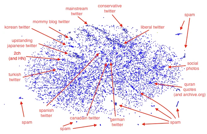
That produces this plot:
Affinity groups
There are obvious clusters for different languages, as you'd expect.
There are a few surprising affinity groupps (at least to me); eg: mommy blogs (blogs whose audience is mothers of young children) cluster extremely tightly.
The most interesting finding from this, at least for me, is how much tighter the right-wing cluster is than the left-wing cluster. The cluster highlighted in red is the right-wing one, and the smear highlighted in blue includes most of the left-wing websites.
The red cluster is just right-wing content, and really only right-wing content. It's extremely tightly connected.
The blue smear contains all the left-wing and liberal outlets. It's not tightly connected at all. For example the immediate neighbors of the huffington post aren't democracy now and current affairs, they're mashable, yahoo news and linkedin. The immediate neighbors of slate are the LA NBC affiliate and reuters. But the immediate neighbors of the daily caller are the washington times, redstate.com, bizpacreview.com.
Random walks
That difference in tight clustering has important consequences for how recommender systems work. Twitter's Who to Follow system, for example, recommends accounts to follow based on a similar embedding to the one I used here (though using the follow graph instead of domain names).
Who to follow (and other recommender systems like the ones used in For You Pages) recommend near neighbors to things the user already likes.
Imagine two hypothetical users, A and B. A watches fox news, B reads the guardian.
B creates a twitter account and follows their favorite guardian columnists. Because the guardian is in that big smear along with mainstream publications and content not related to politics, they get recommended a variety of accounts to follow; new york times columnists, sports people, fashion influencers, etc. The recommendations they get at each step have high variance, meaning there's a high amount of variety in the neighbors of the things they follow and therefore also in the recommendations, which means this random walk has a short mixing time. It's a random walk because the step (follow action) is a random choice from the list of recommended accounts, and the recommended accounts are the neighbors of the accounts the user already follows. Short mixing time means that in a short number of steps it becomes impossible to predict, just knowing where the user started, where the user has gone to. The recommendations could take you anywhere.
A creates a twitter account and follows their favorite fox news personalities. Because right wing accounts are tightly clustered, if you follow right wing accounts you only get recommended other right wing accounts. That means this random walk has poor mixing; if you just know where the user started you can make a good guess about where the user ends up (somewhere in that tight cluster), even after a long time.
When people talk vaguely about social media rabbit holes, this is the concrete thing they're gesturing at.
This difference in cluster tightness explains why right wing social media is better at capturing people in rabbit holes than left wing social media is. And that partly explains why the right wing has been relatively so much more successful on websites like twtiter.
High school cafeteria
This clustering gives you something that's much more like a high school cafeteria than it is like a town square. The jocks sit at the jocks table and only talk to other jocks, the mean girls sit at the mean girls table and only talk with each other, and most people sit somewhere basically chosen at random.
Most people aren't members of one of the tight-knit tables, but msot of the drama comes from those tables.
Interactive Plot
Here's an interactive version of the plot that you can play around with yourself. Hover over it with your mouse to see the domain names. What communities do you find?