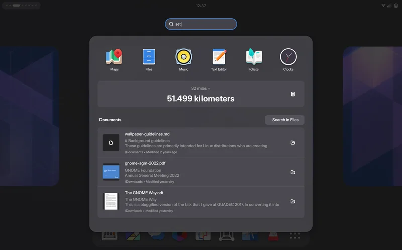
The GNOME Shell user interface has mostly seen minor refinements and quality of life updates in recent cycles, but on the design side we’ve explored a lot of longer-term things we’d like to do. Some of these we have relatively complete plans for, others are more vague ideas that need more research and prototyping. As always, getting things like these implemented depends on developer capacity and interest (and sometimes funding).
While each of these ideas may require additional discussion, prototyping, and testing, we (the design team) have collected them all together here to share our longer-term vision and to give each idea more visibility.
Search
The coherent and fluid spatial model was one of our proudest achievements with GNOME 40. When you navigate GNOME Shell, interface elements always come from somewhere, and exit to somewhere else, in a way that’s semantic and predictable over time.
However, there are a few areas we’ve never been able to fully extend this ethos to. This includes GNOME Shell search, which just replaces the entire overview with search results when you start typing, with no animation or spatial model. We’ve long had the idea to switch to a more semantic layout for this, namely a search results overlay which spawns out of the search entry, above the rest of the overview. Very recently there has been some movement towards implementing this, and it’s likely that it will ship in 51 this fall.
In addition to the layout change, we’d also like to update the search results with richer types of content and actions. Other OSes and various third-party apps (Alfred, Raycast, etc.) have search with built-in file previews, multiple actions per search results, search filters, and more.
Some of this would probably require new APIs and apps to be ported to them, but there is a lot we could do here by just redesigning the existing UI.
Editable Quick Settings
The Quick Settings pattern has seen wide adoption across all OS interfaces over the past decade, for obvious reasons: It puts a few essential pieces of information at your fingertips, and makes it easy to toggle some frequently needed system settings without going to the Settings app.
We’re quite happy with our implementation, but as we’ve added more features (dark style, night light, power modes, keyboard backlight, etc.) the quick settings menu has grown larger and larger. And there’s more: There are a number of additional, even more niche things people would like in this area, such as a way to stop the computer from sleeping (the “Caffeine” extension adds a toggle for this).
In order to accommodate all these cases, Android and iOS allow customizing this menu, allowing people to add or remove the more niche quick toggles depending on personal use. We would like to do something similar, with an inline editor as part of the menu in GNOME Shell.
Simplified Calendar Popover
The Calendar Popover in the top center has always been a a bit of an odd mix of things. It contains several loosely related elements that can each have wildly different amounts of content: Sometimes there are lots of notifications, but no calendar events or clocks. Some people have lots of world clocks but don’t get many notifications. Until a few releases ago we even had the Do Not Disturb switch in this popover, despite functionally being a quick setting.
Other systems (e.g. Android, Chrome OS) solve this by having the most important part of this menu (notifications) grouped with quick settings. This leaves only smaller, and less important items, which are also thematically better aligned: Calendar, events, world clocks, and weather.
This move would also group the most frequently accessed systems status items (notifications and quick settings) in a single location, rather than having them spread across two separate ones.
Drag & Drop Window Organization
During the process of experimentation and user testing leading up to GNOME 40 we also played with alternatives to the mini-workspaces in the overview. One particularly interesting concept revolved around drag & drop: Instead of having to target one of the tiny workspaces at the top, the real workspaces would scale down when you start dragging a window, allowing for larger, richer drop targets and simplifying the spatial model to a single set of representations for windows in the overview.
The specific interactions would need some refinements, but the testing we did leading up to GNOME 40 was promising, so we feel it would be worth giving this another try. In recent weeks, Cleo Menezes Jr. put together an extension testing this idea. We’re hoping to iterate on the design in the extension, and see where things go from there.
Mosaic & Tiling
More powerful tiling is something we’ve long wanted, but which has never quite materialized for technical reasons. More generally we’re interested in improving window management as a whole though, making it a lot less manual and fiddly. A while back we designed a concept called “Mosaic”, which auto-resizes windows to fit new windows, negotiating space between different windows’ optimal sizes. This blog post describes the concept in more detail.
There have been a number of extensions trying to implement parts of this concept over the years, but fundamentally the problem is that this would need better support in the compositor, so it can’t be cleanly done in an extension.
That said, Cleo Menezes Jr’s MosaicWM extension is currently actively maintained and implements most of the concept. As the design team we’re in touch with them, and want to continue collaborating to evaluate and refine the design further. At the same time, there is groundwork that could be laid that doesn’t depend on design (e.g. better tiling support in Mutter, richer min/max window size metadata).
Window Switching
The Super+Tab / Alt+Tab switcher has long been an area we’ve wanted to improve. There is a tension between wanting to keep the list of items manageable (this is why windows are grouped by app), and the ability to switch to the last few windows quickly, regardless of what app they belong to. Most other systems either have our current app grouping approach (Apple platforms), or just expose all windows in one gigantic multi-row spread (Windows).
Our hypothesis is that there are two separate types of use cases for this UI: Quickly switching to one of the most recent windows, and switching to any arbitrary window easily with the keyboard. If this is the case, perhaps these could both be better addressed by mixing separate windows (for the most recent few windows) and grouping (for all older windows).
We have high level concepts for this, but it would need further refinements and iteration before we can say that this would be a clear improvement over the status quo. It’s potentially something that could be prototyped in an extension though, so if you’re interested in that please let us know!
Login Screen Grid
This is almost a meme at this point, because it keeps almost happening every few cycles, but we still really want a more visual treatment for the login screen. The current list is not terribly ugly or problematic but it is a bit boring, and given that this is the first thing you get when booting up your computer we could do a better job welcoming people.
Dynamic Battery Icon
Over the years we’ve had many discussions on how to make the battery icon more expressive, and make it easier to read the status at a glance. Android and iOS both moved to a larger battery indicator that is wider than the standard square status icons. We’d like to do the same, both to be able to give people a clearer idea how much battery the device has, but also to e.g. be able to better integrate the percentage. This would be great on desktop, but especially also on GNOME Shell Mobile, where battery status is even more important and panel space is at a premium.
Transparent Panel
Another long-awaited and discussed feature that never quite made it across the finish line is the transparent panel. The idea is simple, and most other OSes (particularly mobile ones) already do this: When the wallpaper is low-contrast and a single color, just don’t show the panel background and let the wallpaper shine through. It’s a small thing, but with the right wallpaper it’s delightful ð
There is a relatively complete implementation from a few years ago by Jonas DreÃler, but it needs testing, polish, and review.
How do we get there?
Some of these concepts are small and self-contained, others are huge and have been evolving for years, but they all share one thing in common: They need your help to come to life!
In some cases that’s mostly a matter of implementation. In others we’ll need more experimentation, iteration, and discussions with various stakeholders. For complex interaction changes it’s probably good to start with a rough prototype so people can try the behavior early and we can iterate on it. In other cases it would be good to first remove technical blockers to make the new designs implementable in the first place (looking at you, rounded clipping!).
In the past, GNOME Shell was significantly harder to contribute to and test than apps since you needed to use tools like jhbuild. This has changed in the past year: You can now easily build and test your branch in a nested session from Builder using Mutter Devkit. If you use GNOME OS, you can even build a sysext to install your branch on your host system. This allows daily driving experimental branches easily, which is super helpful for evaluating changes to everyday workflows.
As the design team we can only propose ideas and work with developers to make them happen. If you’re interested in helping with implementation, we’d be happy to point you to the right maintainers to talk to, and iterate on concepts together. In some cases we definitely also need to do more user research, so any help with that would also be very welcome. For any of the above, feel free to reach out in the #gnome-design channel on Matrix.