Instagram has changed its logo – and it is a little illegible.
The company has replaced the old, cursive “wordmark” that it used for its app with a new, much rounder look. But the design has already received some backlash online, with users noting that it now looks a little like the app is called “Instagzam”.
“We updated the Instagram wordmark today, which is more than a decade old and felt dated,” said Adam Mosseri, who runs the app at parent company Meta, in an update announcing the new look. “We feel the refresh is sharper and more modern, but references the original and has the simplicity and craft that's always made it Instagram.”
Comments on Mr Mosseri’s post pointed out that the app appeared to have changed its name to incorporate a “Z”. But he was also hit by a range of other criticisms, by users who complained that it reflected misguided priorities at parent company Meta.
“And in today's episode of things Meta have done that we didn't ask for whilst they're ignoring what their users actually want...” read one post, which has since been like more than 2,500 times.
“Yeah, soooo we just want our followers to see our content and get our monetization back,” another wrote, in reference to algorithm changes that mean that Instagram is more likely to push posts from other sources into the feed. “We don’t care.”
In a separate post, Instagram’s design team said the new design was chosen from “hundreds” of different versions that were made. It also also comes with a range of other changes, including new and updated fonts, a new handwriting typeface.
“We’re writing a new chapter at Instagram with a refreshed wordmark and brand system that reflects the handcrafted spirit of our creative roots,” it wrote. “Obsessing over every curve, ligature and spacing detail, our Design team went through hundreds of iterations to update our wordmark.
“That work extended to the broader brand system across type, motion, colors and more, all designed to be in service of showcasing our community’s endless creativity.”
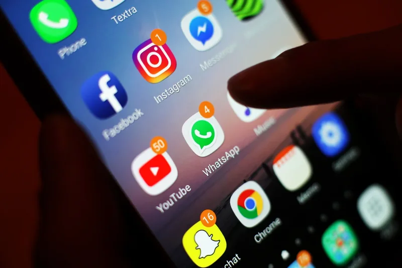
The update does not change the logo that appears throughout the app, including on the app icon that users press to open it. That sunset-coloured, flat-looking image was introduced almost exactly a decade ago, when Instagram switched from a more realistic picture of a polaroid camera.
Meta is yet to give any indication of whether the new look will be reflected in any other changes – including any possible redesign of that icon. But a long blog post from its design team suggested that the while the “gradient remains a core part of our brand, you’ll see a more subtle use of it alongside refreshed motion, layout and UI”.