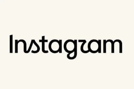
Instagram changes its wordmark for the first time in 10 years
Instagram has updated one of the most recognizable parts of its branding, replacing the cursive wordmark it has used for the past decade with a new design that mixes cursive and print styles.
The change is limited to the wordmark. Instagram’s familiar camera icon remains unchanged. Instagram head Adam Mosseri said the redesign was prompted by the fact that the wordmark had not changed in 10 years, describing the new version as cleaner and more modern while retaining references to the original design.
Users have pointed out that the hybrid typeface can be difficult to read, with several saying the word appears to read “Instagzam” rather than Instagram. The redesign has also prompted reactions from users who preferred the old wordmark.
Article continues after this advertisement
Mosseri shared the redesign on Threads specifically to see what users thought, while Instagram’s design account showed several other typefaces considered during the process. Some of the alternatives shown by the design team are noticeably more conventional and legible than the version that made it to the app.
The wordmark’s previous major redesign dates back to 2016, when Instagram moved away from its older skeuomorphic branding and introduced the colorful camera icon that became its current visual identity. The wordmark itself has remained in place since then.
For a change that affects little more than the way Instagram’s name is written, the redesign has managed to generate plenty of discussion. The camera icon is still the same. The word Instagram, however, now looks considerably different.