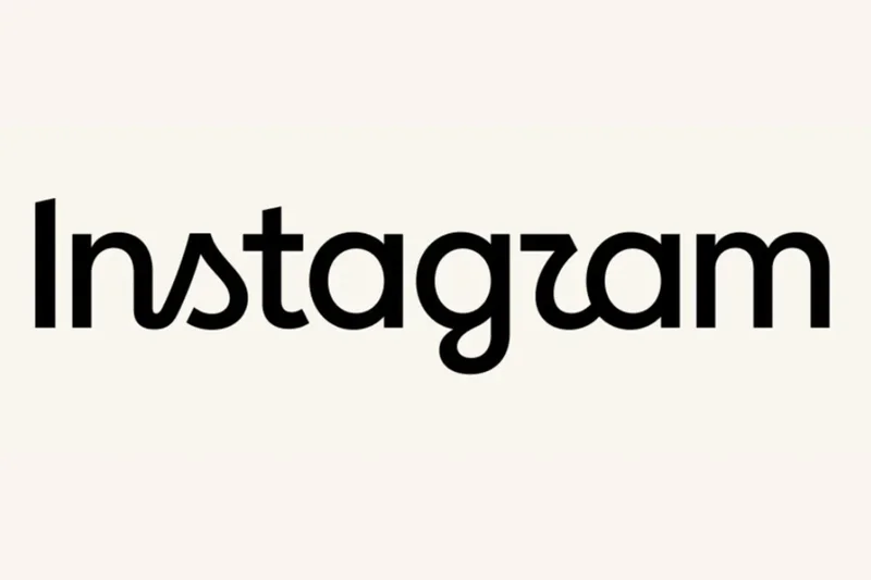
Instagram has a new logo wordmark. The new design was announced by Adam Mosseri âfather of three boys, married to an amazing woman and, aw shucks, yeah, now that you mention it, head of Instagram âon his own account yesterday. Mosseri’s post described the revision as “cleaner and more modern, with references to the original and the simplicity and craft thatâs always made it Instagram.” And boy, do people hate it.
I mean, where to begin? The most obvious place to start is with the glyph for the letter âr,â which looks like no lower case “r” that has ever existed before nor âif there is any mercy left in the worldâ any that will ever exist again. (It does, however, look strikingly like the lower case Greek letter Ï; perhaps this is the Greek alphabetâs belated revenge for the inexplicable abuse itâs suffered at the hands of American fraternities and sororities over the years.)
Beyond the genuinely mystifying “r”, thereâs so, so much else at which to shake one’s head here. There’s the jarring mixture of cursive and printing; the inexplicably jaunty little angled stroke at the top of the âIâ; the rag-tag mixture of stroke weights; the fact that the âgâ looks like the âaâ with a nasty infection; and a million other things that I probably havenât even noticed but are giving professional typographers aneurysms as we speak.
Ultimately, though, all those things are stylistic choices. Theyâre bad ones, to be clearâbut theyâre superficial. Iâd argue that the real problem with the new wordmark is more fundamental and conceptual than those weird pieces of, um, design. The old wordmark is, at its most basic level, meant to recall human handwriting. It doesnât actually look like handwriting, obviously, but thatâs ultimately what these sorts of typefaces are often meant to evokeâa sort of folksy, hands-on charm. Instagram: itâs photography, itâs DIY, its name is written in a script font. You donât have to like it, but thereâs at least some measure of conceptual coherency to it.
The new version takes the old and⦠You know that thing that Preview (and no doubt Windows equivalents) does when youâre circling something on a document? When it âfixesâ the rough, all-too-human scrawl youâve added by converting it into a perfect ellipse? I guess thereâs someone out there who doesnât hit Cmd-Z as soon as this happens, and maybe theyâre the same person who came up with this idea, because itâs essentially the same thing, but applied to a gazillion-dollar companyâs branding. It takes something designed to evoke a feeling of humanity and… removes the feeling of humanity. It makes no sense…f
…
â¦but then, the more you think about it, the more sense it makes. For all Metaâs hilarious wait-are-we-the-bad-guys? energy, I canât imagine that they set out here to arrive on a nice typographical embodiment of everything that big tech doesnât understand about people. But thatâs where theyâve landed: a wordmark takes the basic shapes of its predecessorâs glyphs and drains the last vestiges of anything remotely human from them. What’s left? Just the shapes themselves: cold, empty, hollow, nigh on illegible âand, if you look at them long enough, you see what’s really going on: they’re devolving slowly into the same typeface used for the Meta corporate wordmark.
Why yes, folks, it is a big metaphor for AI/enshittification/everything else: the internet, what should have been humanity’s greatest creation, just without the humans. If you want a picture of the future, imagine the color beige stamping on a human faceâforever.