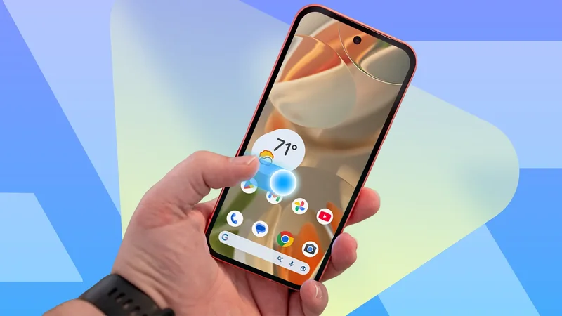
Whenever a friend texts me that they have switched from an iPhone to an Android phone, I offer to help set it up.
Yes, you must move contacts over, turn on RCS, and pick your default apps. Yet none of it prepares them for when they swipe, and the screen doesn't respond.
The hardware on flagship Android phones is universally praised, and Android is a pretty refined OS at this point.
But the phone still sits there waiting to be told how you want to interact with the screen, and getting that layer right is the most important change a switcher can make.
Muscle memory is what you're really migrating
You don't have to retrain the thumb
Years of iOS teach the thumb to swipe in from the left edge, or to reach for the back button in the upper-left corner. When a lifelong iOS user picks up Android, the thumb does the iOS thing on autopilot.
If the OS doesn't respond the way they expect, the experience sours from the very first minute.
I've watched perfectly competent adults poke helplessly at their new Android, all because the default navigation didn't line up with their reflexes.
Gesture navigation is standard issue at this point, but a surprising number of phones still don't have it turned on.
After all, Android was associated with the three-button bar at the bottom of the screen for a long time.
Second-hand handsets, older carrier configurations, and restored backups have a habit of bringing back the three-button layout.
Notification panels are still a mixed bag
One UI got the split panel right
The next thing a switcher reaches for is the notification shade.
iOS has trained them that the upper-left corner means notifications and the upper-right corner means Control Center. They've been doing it since 2017.
Good news on Samsung. One UI has split the panels since One UI 7. However, it divides the swipe area in roughly a 7:3 ratio.
Pixel doesn't do this yet. The groundwork has been in beta since 2024, and it's still not here two releases later.
Predictive Back and the rest of the gesture set
No more guessing where the phone takes you
iOS has always shown you where a back swipe is heading, and that preview is a big part of why the OS feels so composed.
Android took its time to fix this. Back navigation used to be a gamble, either sending you up a screen, into a menu, or out of the app entirely.
Android 16 fixed this by making Predictive Back animations the default and requiring apps to support them.
Since then, the swipe comes with a preview. You can see if you're going back a step or to the home screen before you commit and cancel mid-motion if necessary.
Everything else is muscle memory waiting to happen, because Android and iOS landed on the same answers.
Home is a swipe up from the bottom edge, and multitasking is the same with a brief pause at the end.
Three-button navigation still has a place
Some thumbs want a target they can see
I should say, before anyone assumes otherwise, that I hold no grudge against the three-button bar. It's just not my preference.
There's a reason the buttons never went away. Some people have limited motor control or special accessibility needs. Others may prefer a target they can see and hit.
Not to mention it's a much better version of itself than it was a few Android releases ago.
Predictive back, for one, didn't skip the three-button crowd. A long press brings up the same preview gesture that users get.
So if you see a switcher who's happy with what they have, by all means let them be.
The best navigation is the kind you forget
You never hear anyone compliment a back gesture. Failure is the only thing that is noticed.
A phone doing its job should fade into the background, and fixing navigation first is the fastest way to get it there.
The next time a friend texts to say they've made the switch, I'll do the same round of contacts, RCS, and default apps. But I'll change the navigation setting before any of it.
When that's done, it's time for other smaller conveniences. One-handed mode, Quick Tap for screenshots, and so on.