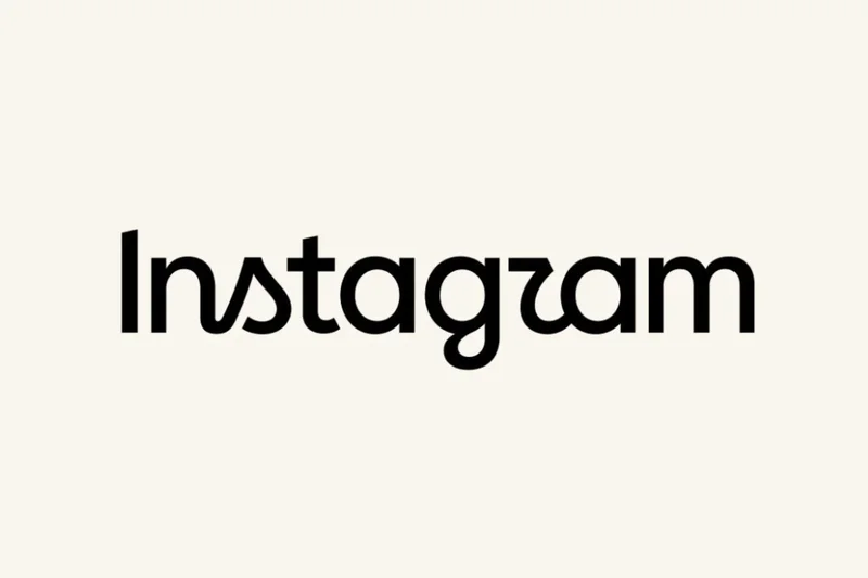
Instagram has unveiled a new wordmark, moving away from the recognizable cursive typeface it’s used over the last decade. The updated wordmark is a strange mix of half-cursive half-print that’s somehow less legible than its predecessor. Like, that totally says “Instagzam”, right?
This is Instagram’s new logo
Instagzam.
Instagzam.
“The wordmark at the top of the app hasn’t changed in 10 years, so it was time for a refresh,” Instagram head Adam Mosseri announced on his account. “Cleaner and more modern, with references to the original and the simplicity and craft that’s always made it Instagram.”
This story is developing…
Follow topics and authorsfrom this story to see more like this in your personalized homepage feed and to receive email updates.
Most Popular
- Google’s Pixel 11 series pairs a little new hardware with a lot of new software
- How Google’s new Pixel 11 phones compare to last year’s models
- Xbox Elite 3 prototype pad leaks with tiny built-in screen
- The 7 biggest announcements of Google’s Pixel 11 launch
- The Pixel Tag is Google’s answer to the AirTag