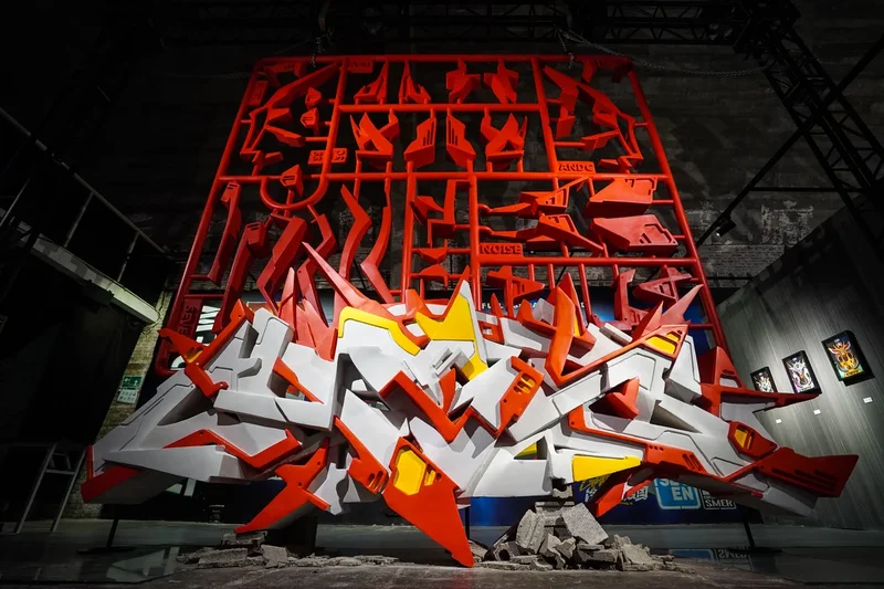
When a broad-edged marker touches a surface, a Chinese character begins to move beyond the familiar order of horizontal and vertical strokes.
As a dip pen moves, the line sharply shifts between thick and thin. Each turn carries the energy of street graffiti while echoing the precision and ornamentation of Gothic calligraphy.
The traditional Chinese character fa, meaning “to prosper” or “to flourish”, appears bold and forceful while remaining unmistakably Chinese. It seems to have grown out of traditional calligraphy while retaining the visual intensity of street art.
This fusion of writing traditions lies at the heart of ABS Street Ink, a newly released Chinese typeface by graffiti artist Xu Yan, who blends Gothic calligraphy with the visual language of street graffiti.
Built on the use of broad-edged markers and flat-nib dip pens, the typeface gives Chinese characters a strong sense of movement and tension without sacrificing legibility. It also represents an exploration of how Western lettering traditions can be adapted to the structural logic of Chinese characters.
Xu, 38, is a co-founder of ABS Crew and an early practitioner of graffiti in China. He first encountered graffiti in 2005 while in high school, when the art form remained a niche culture largely introduced through foreign documentaries, magazines and hip-hop culture.
Xu and his classmates began writing their names on walls near their school. For them, graffiti was not simply drawing but a way of expressing identity through writing.
Graffiti artists often call themselves “writers”, emphasising the construction of letterforms and personal style. This understanding connected naturally with Xu’s childhood training in Chinese calligraphy.
He began practicing brush calligraphy in primary school and later studied printmaking at the Xi’an Academy of Fine Arts and public art at the Beijing Institute of Fashion Technology. In 2011, Xu and his team won both the China and Asia championships at Wall Lords, an international graffiti competition in Asia, and ABS Crew later became involved in street art projects and commercial collaborations.
The origins of ABS Street Ink can be found not only on city walls but also at the calligraphy desk.
Xu has long been fascinated by Gothic calligraphy, a Western lettering tradition known for angular structures, dense compositions and decorative forms. Written with broad-edged pens, Gothic script creates dramatic contrasts between thick and thin strokes.
Graffiti tools, including broad markers and wide brushes, share similar qualities. Their flat edges allow artists to vary stroke width through changes in angle and direction.
This similarity led him to consider whether Gothic writing techniques could be adapted to Chinese characters.
His first experiments date back to 2012, when he explored Gothic-inspired Chinese lettering in his graduation work. Years later, after connecting with FounderType, the idea developed into a complete typeface project.
For Xing, ABS Street Ink succeeds because it avoids becoming either loose graffiti lettering or a simple imitation of Gothic script.
“It uses Gothic structure as the skeleton and graffiti strokes as the surface,” he says.
Adapting Gothic calligraphy to Chinese writing involves more than adding Western decoration.
Chinese characters have their own internal architecture, including structural balance, spatial relationships and the distribution of empty space. Excessive ornamentation can damage recognition.
“Western audiences may not understand the Chinese characters, but they can still recognise the Gothic style,” Xu says.
He previously participated in a calligraphy exchange connecting Beijing and Berlin, in which artists wrote together via live projections. Even without understanding the content, participants could sense the rhythm and energy of the writing.
In graffiti culture, this quality is called “flow”. In Chinese calligraphy, it resembles the continuous movement that carries the brush’s energy from one stroke to the next.
For Xu, this shared sense of movement connects the two traditions. Graffiti may be associated with rebellion and freestyle, but at its core is the creation of a distinctive personal writing style. Chinese calligraphy likewise reflects the personality and rhythm of the writer.
One evolved on paper; the other found its expression on walls and in public spaces.
ABS Street Ink is designed for visually driven applications rather than long passages of text. Xing expects it to appear in fashion branding, music festivals, posters, street culture packaging, film and television titles, esports, and digital media.