Exactly the kind of nerdy UI/UX discussion I love:
Lea’s pushing back on light/dark mode implementations that display three state options for visitors:
- Light
- Dark
- System (core of the debate)
Why show a System option at all when:
[…] a good two state control can actually express all three states — users just need to apply the override the first time it becomes relevant.
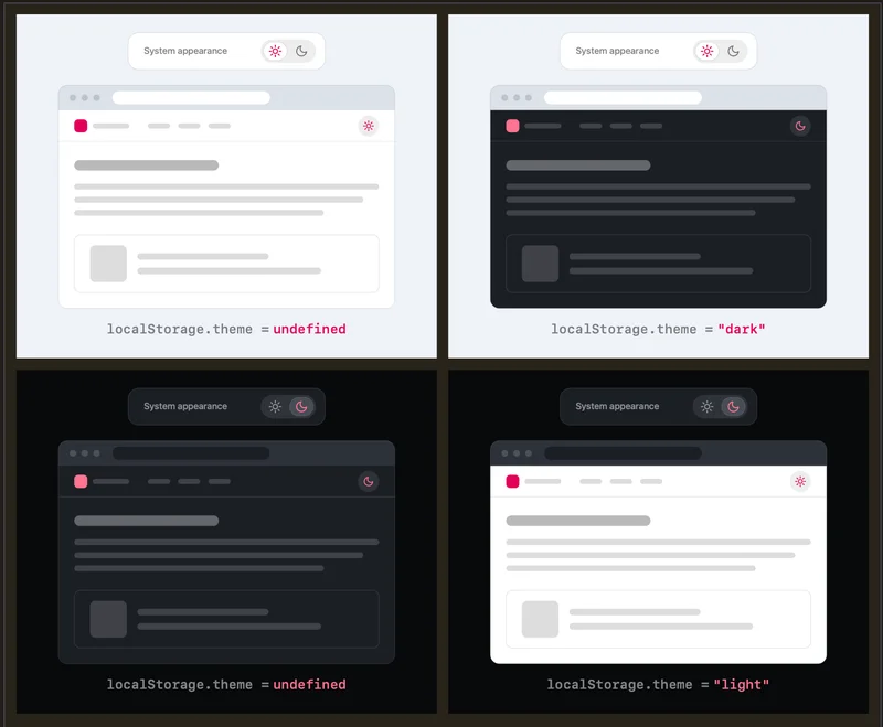
The first figure succinctly illustrates the point:
In short: No preference? Fall back to the system settings and provide a setting to override that if that’s needed/preferred. Then that preference is stored in localStorage for future sessions.
Something I sorta missed the first time I saw the image is that perhaps we don’t even need to display two states when we know what color scheme is active:
- Light by default? Show a Dark option to override that.
- Dark by default? Show a Light option to override that.
Personally, I’m convinced. Less UI that accomplishes the same as more UI is generally a good thing. Lea’s point goes way beyond that, getting into well-considered reasons that go beyond simplicity.
An interesting consideration is what happens when toggling back to a state. Like, if we start with a Light system preference, toggle it to Dark, then back to Light. Do we get a new override preference or go back to the system setting would be an undefined localStorage value? Maybe it doesn’t matter because theme switching isn’t exactly the primary user intent:
Remember, this control is
entirely tangentialto the actual user goal for visiting the website. Even if their intent were to pinlightinstead of reverting toSystem (light), this is something they would only notice once these diverge, i.e. the OS switches to dark. At that point, fixing it is a single click away. It’s such an easy fix, that there is no point in dwelling on it further.
To be clear, Lea is referring to persistent UI. The guidance is targeting toggles that are always visible to the visitor. That’s really, really common in a site’s header/navigation (my personal site included). If that’s the pattern, then it could distract from the visitor’s primary intent. And the more options we see, the more cognitive dissonance is introduced.
I think there’s an even more compelling argument in the thread:
Yes, please! Development for the preference, but no need to show an override when the setting is in the browser itself. Then a tri-state toggle might be more acceptable.
Speaking of which, Lea does offer two scenarios where three states make sense:
- Color scheme setting that lives a separate settings panel (i.e., the toggle is in a completely different context that isn’t interfering with the visitor’s primary intent)
- When color schemes are implemented differently depending on the system setting (i.e., more than two color schemes are offered )
Worth the full read, if you ask me!