Patenting Your ML Pipeline: A Software Engineer's Guide to USPTO Flowcharts
So you built something novel. Maybe it's a retrieval pipeline that actually keeps hallucinations under control. Maybe it's a distributed training scheduler that shaves 30% off your GPU hours. Maybe it's just a clever cache eviction strategy that your team thinks is obvious but no one else has shipped.
Someone in leadership says the word: "We should patent this."
And suddenly you — the engineer who actually knows how the thing works — are staring at a patent attorney's intake form that asks for "a flowchart of the invention's method steps, in USPTO-compliant line art format."
No one taught you this in your CS degree. Let's fix that.
This post is a practical guide for software engineers on how patent flowcharts actually work, why your pipeline architecture matters for the filing, and what tooling exists now so you don't have to hand-draw everything in Lucidchart at 2 AM.
Why Your Pipeline Diagram Isn't a Patent Flowchart
Here's the first thing that trips up engineers: the system diagram you keep in your team's Notion is not a patent drawing. Not even close.
Your internal diagram is optimized for human understanding at a glance. It uses color. It uses icons for "database" and "API gateway." It groups things in boxes with rounded corners. It's pretty.
A patent flowchart, under 37 CFR 1.84, has to be:
- Black and white — no color, no grayscale shading. Pure line art.
- Formally structured — rectangles for process steps, diamonds for decisions, ovals for start/end.
- Numbered — every meaningful element gets a reference numeral (
102,104,106...). Those numerals appear in the written specification and must match. - Readable at 50% scale — the USPTO may reduce your drawings for publication. If your text is 6pt now, it's unreadable after.
- Stripped of implementation branding — no AWS logos, no "Snowflake" boxes. Replace them with generic technical descriptions like "distributed object store" or "columnar analytics engine."
In other words: the aesthetic choices that make your architecture diagram good for humans are exactly the things that make it bad for a patent examiner.
The Two Diagrams You'll Usually Need
For most software inventions, the attorney will ask for two distinct figures:
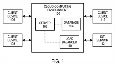
1. System Architecture Diagram (usually Fig. 1)
This answers the question: where does the invention live?
It shows the hardware-software environment — client, server, network, storage, any external APIs — as a graph of functional blocks. Every block gets a reference numeral. Data flow between blocks uses directed arrows.
Key rule: blocks must represent functional roles, not specific products. "Inference engine (104)" is fine. "NVIDIA H100 GPU cluster" is not. The patent protects the method, not a specific vendor's hardware.
2. Method Flowchart (usually Fig. 2 onward)
This answers the question: what are the ordered steps the invention performs?
It's a process diagram. Start at the top with an oval ("Receive user query, 202"), walk down through rectangles ("Embed query into vector, 204"), use diamonds when the logic branches ("Confidence > threshold? 206"), and terminate in an end oval.
Each step should be discrete enough that a reasonably skilled engineer could implement it. Avoid mega-steps like "Apply transformer architecture" — that's a black box. Prefer "Encode input tokens using positional embeddings (304); Apply multi-head self-attention (306); Normalize output and forward to feed-forward network (308)."
The reason for this granularity is Section 112 enablement: the patent has to teach a "person having ordinary skill in the art" (the patent world's version of a senior engineer) how to reproduce the invention. A black-box diagram doesn't enable anyone, so it doesn't satisfy 112, so your patent either gets rejected or — worse — gets granted but is unenforceable because a competitor can argue it was never enabling.
A Worked Example: Patenting a RAG Pipeline
Let's make this concrete. Say you've built a retrieval-augmented generation pipeline with a novel re-ranking step that uses cross-encoder scores to dynamically adjust retrieval depth. (Not a real patent — just a realistic example.)
Your architecture diagram in Notion might look like: User → API Gateway → Retriever (Pinecone) → Re-Ranker (Cohere) → LLM (GPT-4) → Response
Your system architecture diagram for the patent would abstract that to:
- (102) User interface module
- (104) Query processing unit
- (106) Vector retrieval engine with dynamic depth parameter
- (108) Cross-encoder re-ranking module
- (110) Large language model inference module
- (112) Response synthesis and formatting module
Arrows show the data flow. Notice there's no Pinecone, no Cohere, no OpenAI — because those are implementations of the functional roles, not the functional roles themselves.
Your method flowchart for the novel step would look like:
(202) Receive user query at query processing unit
       ↓
(204) Generate initial retrieval candidate set of size N using vector retrieval engine
       ↓
(206) Compute cross-encoder relevance scores for each candidate
       ↓
(208) Compute aggregate confidence metric from relevance score distribution
       ↓
<210> Is aggregate confidence below threshold τ?
       ├── yes → (212) Increase retrieval depth to N' > N; return to (204)
       └── no  → (214) Forward top-K candidates to LLM inference module
Enter fullscreen mode
Exit fullscreen mode
Every numbered box has a corresponding sentence in the specification: "At step 208, the query processing unit computes an aggregate confidence metric..."
That tight coupling between figures and specification is what makes a software patent defensible.
Why This Is a Tooling Problem, Not a Drawing Problem
Here's where engineers get frustrated. Tools like draw.io, Lucidchart, and Mermaid are great for team diagrams but terrible for patent drawings:
- They default to color fills. USPTO needs pure line art.
- They use varying line weights based on zoom level. USPTO needs uniform lines, typically 0.8mm.
- They have no notion of reference numerals as first-class objects. You have to type them manually and hope they stay consistent across figures.
- They export to PNG or PDF without any compliance check for margins, DPI, or numeral legibility.
The result: engineers export a diagram, the paralegal spends four hours "patent-ifying" it in Illustrator, the attorney reviews, something's wrong, loop repeats.
The whole loop is dumb because 37 CFR 1.84 is a deterministic spec. You can check compliance programmatically. You can generate compliant line art programmatically. Nothing about this requires human creativity — it requires a tool that understands the rules.
How AI Tools Change the Workflow
Generic AI image models (Midjourney, DALL·E, SDXL) don't work for this. They're trained on photographs and stylized art. Ask them for "a patent drawing" and you get something that looks vaguely patent-ish but fails on specifics: line weights drift, text is rendered as pixels instead of vector, reference numerals are hallucinated nonsense.
Patent-specific tools like PatentFig AI take a different approach: they treat the problem as structured generation with constraint satisfaction. You describe the pipeline in plain English (or paste your architecture doc), and the engine produces line art that respects the formal constraints — uniform line weights, correct margins, unique reference numerals, consistent numbering across figures.
What this means for an engineer:
- You no longer need to learn Adobe Illustrator to contribute to a patent filing.
- Your architecture description in markdown or Notion can become a first-draft flowchart in minutes.
- When the attorney asks for "add an authentication step between 204 and 206," you can do it yourself in a chat interface instead of waiting for a drafter.
That last point matters more than it sounds. Removing the drafter from the loop compresses a 48-hour revision cycle to a 30-second one, and it means the figures actually keep up with your code.
Gotchas That Trip Up Technical Founders
A few hard-won lessons from engineers I've watched file software patents:
1. Don't patent the obvious. If your "novel" step is really just a wrapper around a well-known technique, the patent will either get rejected as obvious (35 U.S.C. 103) or get granted and then invalidated in litigation. Talk to an attorney about whether there's real novelty before you invest months.
2. Don't wait until the product is public. Under the America Invents Act, you have a one-year grace period from your first public disclosure (blog post, demo, conference talk) to file in the US. You have zero grace period in most of the rest of the world. If you want international protection, file before you ship.
3. Map your figures to your claims. The claims are the legally operative part of the patent. Every independent claim should have at least one figure that illustrates it. If your flowchart covers steps A → B → C but your claim says A → B → D, the claim is in trouble.
4. Keep specification and figures in sync. This is where automated tooling pays off most. Reference numeral drift between figures and spec is one of the top causes of clarity rejections. The numeral 204 should mean the same thing on page 3 and page 23. Tools that enforce this automatically save you from an Office Action.
Wrapping Up
Software patents have a reputation for being slow, expensive, and weirdly adversarial to the engineers who actually invented the thing. A big part of that reputation is the drawing workflow — the part where your technical precision has to survive three handoffs between people who don't code, in a format none of your tools natively produce.
That's a solvable problem. The formal rules of patent drawings are deterministic enough that a well-designed tool can generate compliant figures directly from your technical description, iterate on them surgically when the attorney marks them up, and catch compliance issues before they turn into Office Actions.
If you're about to file a software patent and want to see what this looks like in practice, open the AI patent flowchart generator, paste in your pipeline description, and see what comes out. The first draft of your Fig. 2 will be cleaner than most hand-drafted flowcharts I've seen go to filing.
Build the thing. Patent the thing. Don't let the drawings be the reason the filing slips.
Questions about patenting a specific kind of software system? Drop them in the comments — I'll try to address the common cases in a follow-up post.