TL;DR
- Lazy loading defers offscreen resources: Use
loading="lazy"for images and iframes. For custom elements, use Intersection Observer to load content just before it enters the viewport. Add placeholder skeletons to prevent layout shifts. - Code splitting reduces initial bundle size: Split by route (React
lazy()) so users download only what they need. Split heavy components (charts, editors) to load on demand. Use vendor splitting to separate library code for better caching. - Optimize images at every step: Compress with mozjpeg/ pngquant, resize to actual display dimensions, serve progressive JPEGs, and use CDNs with on-the-fly optimization (Cloudinary, imgix).
- Modern formats beat JPEG/PNG: WebP gives 25-35% smaller files; AVIF offers even better compression. Use
<picture>with fallbacks for older browsers. SVG for icons scales infinitely and stays small. - Responsive images with srcset: Provide multiple widths and let the browser choose. Use
sizesto hint at layout. For art direction (different crops), use the<picture>element withmediaqueries. - Always set width and height attributes: Prevents layout shift (CLS). Combine with CSS
max-width: 100%; height: auto;for responsive scaling. - Prefetch likely-needed chunks:
<link rel="prefetch">tells the browser to download code during idle time, making navigation instant.
Modern SaaS applications ship megabytes of JavaScript, CSS, and images. Users don't need all of it immediately. Lazy loading defers non-critical resources. Code splitting separates code by route or feature. Image optimization delivers pixels efficiently. Together, these techniques dramatically improve initial load times and overall performance.
Why Load Time Matters
Studies consistently show users abandon slow sites. SaaS applications compete on experience, and load time is the first experience.
Large bundles delay interactivity. Browsers must download, parse, and execute JavaScript before users can interact. Smaller initial bundles mean faster interaction.
Mobile networks amplify the problem. 3G connections take seconds to download megabytes. Many users worldwide still use slow connections. Optimize for the median, not the best case.
Core Web Vitals related to loading metric includes:
| Metric | Measures | Impact |
| --- | --- | --- |
| LCP (Largest Contentful Paint) | When main content appears | Affected by large, unoptimized assets |
| FID (First Input Delay) | When users can interact | Affected by large JavaScript bundles |
Search engines consider page speed. Google uses Core Web Vitals as ranking signals. Slow pages rank lower than fast alternatives.
Users form opinions in milliseconds. Speed affects perception of quality and trustworthiness. Fast applications feel more professional.
Lazy Loading Fundamentals
Lazy loading defers loading until needed. Resources below the fold load as users scroll. Features load when users navigate to them.
Native lazy loading for images uses a simple attribute. Modern browsers handle the complexity.
<img src="product.jpg" loading="lazy" alt="Product image">
Enter fullscreen mode
Exit fullscreen mode
Intersection Observer enables custom lazy loading. Detect when elements enter the viewport. Load resources just before they're visible.
```
const observer = new IntersectionObserver((entries) => {
entries.forEach(entry => {
if (entry.isIntersecting) {
const img = entry.target;
img.src = img.dataset.src;
observer.unobserve(img);
}
});
}, {
rootMargin: '50px' // Load slightly before visible
});
document.querySelectorAll('img[data-src]').forEach(img => {
observer.observe(img);
});
```
Enter fullscreen mode
Exit fullscreen mode
Lazy loading iframes saves significant bandwidth. Embedded maps, videos, and widgets are heavy. Load them only when needed.
```
```
Enter fullscreen mode
Exit fullscreen mode
Placeholder content maintains layout during loading. Skeleton screens or blur-up techniques prevent layout shifts.
.image-placeholder {
  background: linear-gradient(90deg, #f0f0f0 25%, #e0e0e0 50%, #f0f0f0 75%);
  background-size: 200% 100%;
  animation: shimmer 1.5s infinite;
}
Enter fullscreen mode
Exit fullscreen mode
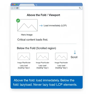
Critical resources should not be lazy loaded. Above-the-fold content, LCP elements, and critical functionality need immediate loading.
Code Splitting Strategies
Route-based splitting loads code per page. Each route becomes a separate chunk. Users download only what they need.
```
// React with route-based splitting
import { lazy, Suspense } from 'react';
import { Routes, Route } from 'react-router-dom';
const Dashboard = lazy(() => import('./pages/Dashboard'));
const Reports = lazy(() => import('./pages/Reports'));
const Settings = lazy(() => import('./pages/Settings'));
function App() {
return (
}>
} />
} />
} />
);
}
```
Enter fullscreen mode
Exit fullscreen mode
Component-level splitting isolates heavy components. Chart libraries, rich text editors, and data tables load on demand.
```
// Load chart library only when chart is rendered
const Chart = lazy(() => import('./components/Chart'));
function Dashboard() {
const [showChart, setShowChart] = useState(false);
return (
setShowChart(true)}>Show Chart
{showChart && (
}>
)}
);
}
```
Enter fullscreen mode
Exit fullscreen mode
Vendor splitting separates library code from application code. Libraries change less frequently. Better caching when app code changes.
// Webpack configuration for vendor splitting
optimization: {
  splitChunks: {
    cacheGroups: {
      vendor: {
        test: /[\\/]node_modules[\\/]/,
        name: 'vendors',
        chunks: 'all',
      },
    },
  },
}
Enter fullscreen mode
Exit fullscreen mode
Prefetching loads likely-needed chunks during idle time. Link prefetch hints tell browsers to fetch resources.
<link rel="prefetch" href="/static/js/reports.chunk.js">
Enter fullscreen mode
Exit fullscreen mode
Image Optimization Techniques
Compression reduces file size without visible quality loss. Lossy compression for photos. Lossless for graphics with text.
```
Optimize JPEG with mozjpeg
cjpeg -quality 80 input.jpg > output.jpg
Optimize PNG with pngquant
pngquant --quality=65-80 input.png -o output.png
```
Enter fullscreen mode
Exit fullscreen mode
Resize images to actual display size. Don't serve 4000px images for 400px containers. Generate multiple sizes during build.
```
// Sharp for image processing in Node.js
const sharp = require('sharp');
async function optimizeImage(input, output) {
await sharp(input)
.resize(800, 600, { fit: 'inside' })
.jpeg({ quality: 80, progressive: true })
.toFile(output);
}
```
Enter fullscreen mode
Exit fullscreen mode
Progressive loading improves perceived performance. Progressive JPEGs render blurry first, then sharpen. Users see content faster.
CDN image optimization transforms on the fly. Cloudinary, imgix, and Cloudflare Images resize and format dynamically.
```
```
Enter fullscreen mode
Exit fullscreen mode
Build-time optimization automates the process. Image optimization plugins for webpack, Vite, and other bundlers.
// Vite with vite-imagetools
import heroImage from './hero.jpg?w=1200&format=webp';
Enter fullscreen mode
Exit fullscreen mode
Responsive Images
Srcset provides multiple image sizes. Browsers choose the appropriate size based on viewport and device pixel ratio.
```
<img
srcset="product-400.jpg 400w,
product-800.jpg 800w,
product-1200.jpg 1200w"
sizes="(max-width: 600px) 100vw,
(max-width: 1200px) 50vw,
400px"
src="product-800.jpg"
alt="Product"
```
Enter fullscreen mode
Exit fullscreen mode
Art direction with picture element provides different crops. Different images for different viewports, not just sizes.
<picture>
  <source media="(max-width: 600px)" srcset="hero-mobile.jpg">
  <source media="(max-width: 1200px)" srcset="hero-tablet.jpg">
  <img src="hero-desktop.jpg" alt="Hero image">
</picture>
Enter fullscreen mode
Exit fullscreen mode
Retina displays need higher resolution. 2x images for high-DPI screens. Avoid serving 2x to standard displays.
```
<img
srcset="icon.png 1x, icon@2x.png 2x"
src="icon.png"
alt="Icon"
```
Enter fullscreen mode
Exit fullscreen mode
Container queries enable truly responsive images. Size based on container, not viewport.
Width and height attributes prevent layout shift. Always include dimensions. CSS can still control sizing.
<img src="photo.jpg" width="800" height="600" alt="Photo" style="max-width: 100%; height: auto;">
Enter fullscreen mode
Exit fullscreen mode
Modern Image Formats
WebP provides better compression than JPEG and PNG. Smaller files with comparable quality. Supported by all modern browsers.
<picture>
  <source srcset="image.webp" type="image/webp">
  <source srcset="image.jpg" type="image/jpeg">
  <img src="image.jpg" alt="Fallback for old browsers">
</picture>
Enter fullscreen mode
Exit fullscreen mode
AVIF offers even better compression. Newer format with excellent quality at small sizes. Growing browser support.
<picture>
  <source srcset="image.avif" type="image/avif">
  <source srcset="image.webp" type="image/webp">
  <img src="image.jpg" alt="Image">
</picture>
Enter fullscreen mode
Exit fullscreen mode
SVG for icons and simple graphics. Vector format scales infinitely. Often smaller than raster alternatives for simple shapes.
<svg width="24" height="24" viewBox="0 0 24 24">
  <path d="M12 2L2 7l10 5 10-5-10-5z"/>
</svg>
Enter fullscreen mode
Exit fullscreen mode
Inline SVGs enable CSS styling. Color changes, animations, and hover effects work natively.
Build pipelines generate modern formats automatically. Transform source images to WebP and AVIF during build.
Implementation Patterns
Above-the-fold optimization loads critical content first. Identify what users see immediately. Optimize and prioritize that content.
```
```
Enter fullscreen mode
Exit fullscreen mode
Image sprites combine multiple images. Fewer HTTP requests for icons and UI elements. CSS background-position selects specific images.
Icon fonts or SVG sprites for icons. Both approaches reduce requests. SVGs offer better accessibility.
```
```
Enter fullscreen mode
Exit fullscreen mode
Content-aware lazy loading considers scroll patterns. Load more aggressively for fast scrollers. Load conservatively for slow connections.
Error handling for failed loads prevents broken experiences. Fallback images or retry logic maintain functionality.
img.addEventListener('error', () => {
  img.src = '/placeholder.jpg';
});
Enter fullscreen mode
Exit fullscreen mode
Lazy loading + code splitting + image optimization \= faster SaaS. We integrate all three.
Each technique is valuable alone. Together, they transform user experience. But they need to work in harmony.
We help you:
- Identify what to lazy load vs. prefetch – Not all resources are equal
- Avoid common mistakes – Never lazy load above-the-fold content
- Set performance budgets – Catch regressions before they reach users
- Measure real improvements – Lighthouse + RUM before and after
Get Complete Performance Strategy →
Conclusion
Lazy loading, code splitting, and image optimization directly improve Core Web Vitals and user retention. Start with the basics: loading="lazy" for offscreen images, route-based code splitting, and image compression. Then layer in responsive images, modern formats like WebP and AVIF, and prefetching for critical next steps.
Measure with Lighthouse and Real User Monitoring to verify improvements. Every kilobyte you avoid shipping on initial load makes your SaaS faster, more competitive, and more respectful of your users' time.
FAQs
1. When should I use lazy loading vs. prefetching?
| Strategy | Timing | Use Case |
| --- | --- | --- |
| Lazy loading | Waits until visibility or interaction | Resources user may never need (images far down page, modals, rarely used components) |
| Prefetching | Loads during idle time | Resources user will likely need next (next route, hover-triggered content) |
2. What's the performance impact of lazy loading above-the-fold content?
Above-the-Fold rules include:
- Never lazy load above-the-fold content
- Doing so delays Largest Contentful Paint (LCP)
- Harms user experience
- Use lazy loading only for content below the fold or triggered by interaction
- For critical images, use
<link rel="preload">instead
3. How do I test if my optimizations actually improve load time?
Testing and measurement tools:
| Tool Type | Specific Tools | Metrics |
| --- | --- | --- |
| Lab data | Lighthouse | LCP, FCP, TBT |
| Real User Monitoring (RUM) | Web Vitals library | Actual user experience |
| Bundle analysis | webpack-bundle-analyzer | Bundle sizes |
| CI/CD | Performance budgets | Catch regressions |